Description
Background
An audience who cares about a product exclusive to the platform can be relied on to continue paying for their subscription to maintain access to the content they care about. Developing these dedicated consumers and creating more is no easy feat - so why make that level of engagement require extra effort, especially when it means using another media platform? Reducing friction for users is integral for optimal user experience, and by offering a streamlined way to take a listen, or even just browse available podcast episodes, the platform can better communicate that the Max experience is more than just a streaming service.
Design Process
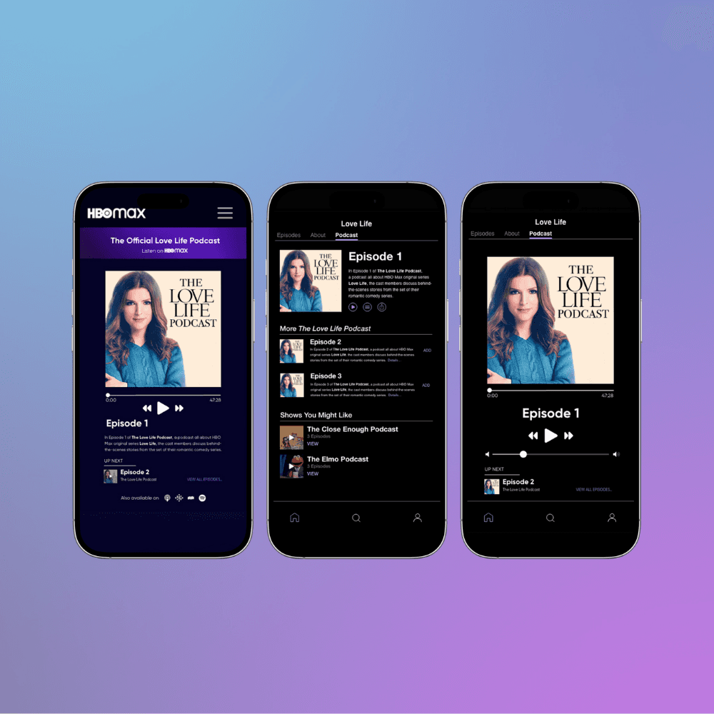
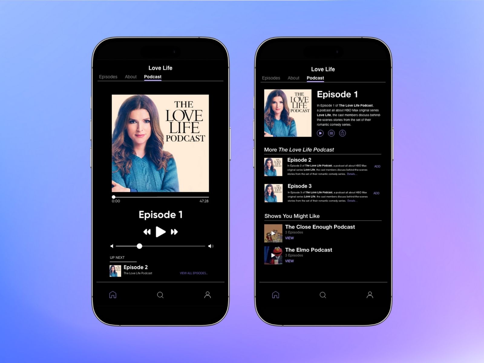
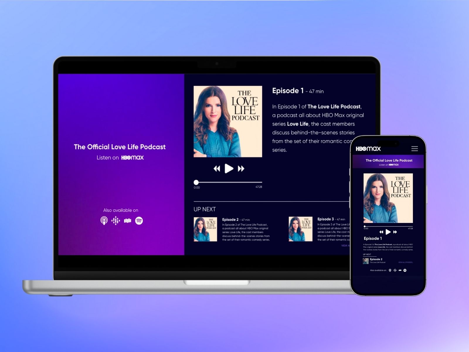
While working at Warner Bros. Discovery (formerly WarnerMedia), I designed concepts for native integration of the podcasts in the Max (formerly HBO Max) website and mobile app, as well as supplementary onsite promotion of the product. I used Photoshop to prepare assets for the designs, and created the interface in Sketch.
Homepage Design
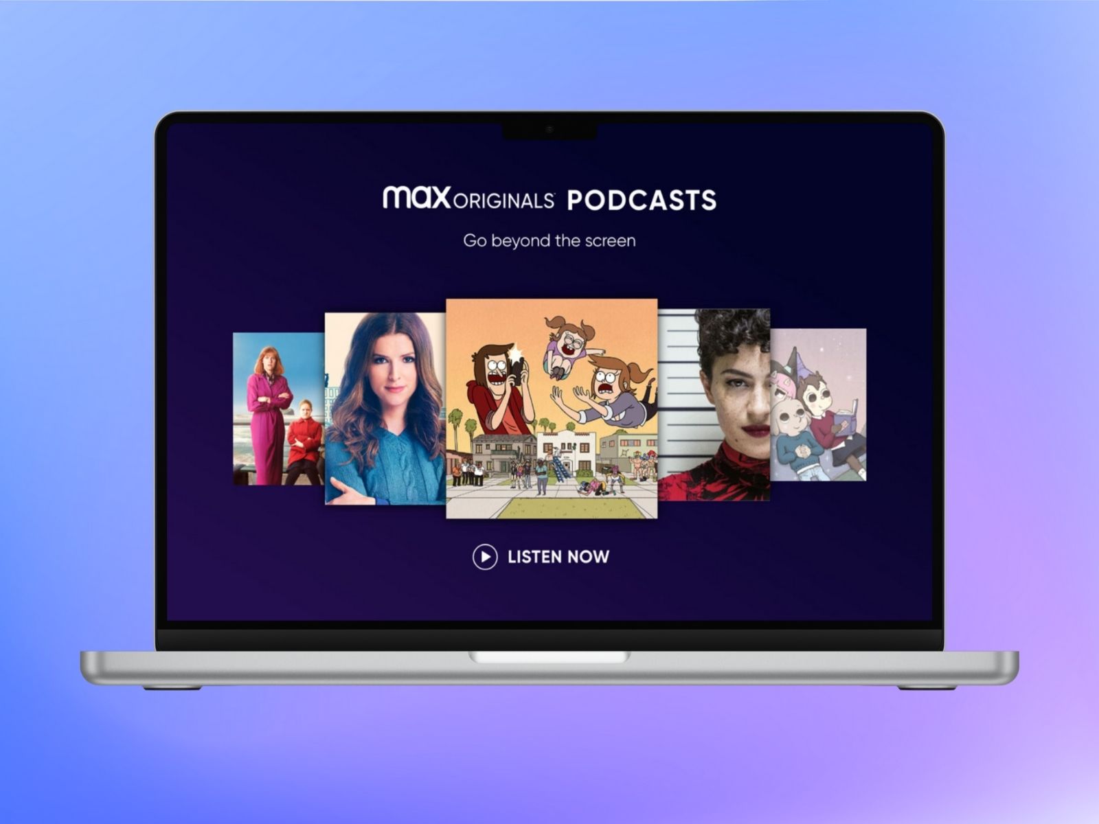
Listicle Page Design
About page design
While I adhered to Lyons' personal brand guidelines, it was necessary at times to create evolutions of the existing assets to fit the project. During the process of designing the site's navigation bar, I found the official logo developed by Max for the show wouldn't fit without losing readability, so I chose to develop a secondary, horizontal version of the logo from the original Illustrator files. Fiddling with an official logo can be a huge no-no if the rationale doesn't check out, but after communicating the value of my rework, it became an official asset of the brand.
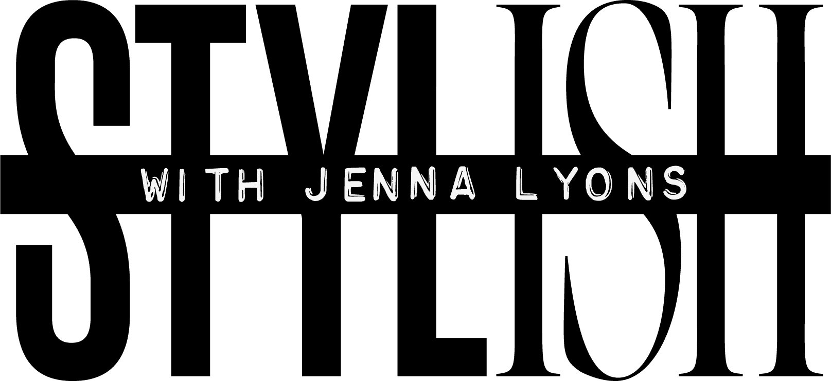
Official show logo
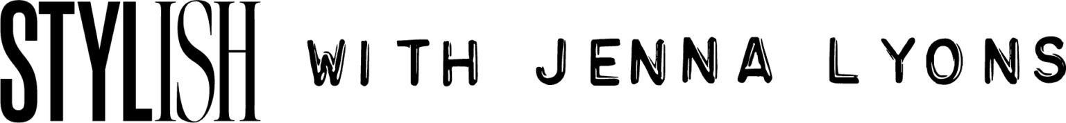
My modified version